Thursday, 31 December 2015

Golden Pints 2015

Of course it should really be "Golden Cans" this year as 2015 has definitely been the year of the can (schooners are so 2014). My own can consumption must be well into single figures which I think shows my commitment to the can revolution. 

So on to the prizes:
  1. Best UK Cask Beer: I have to admit this one surprises me but the beer that most blew me away was Black Sheep Bitter. Only 3.8% ABV too. Must be because I'm a lightweight nowadays. Honourable mention to another 3.8er: Thurstons Horsell Gold.
  2. Best UK Keg Beer: Yes, definitely had some this year. Though I'm not sure if the pint of San Miguel I had when I saw New Model Army counts as UK. Actually being one myself I had a half of Southpaw from Gipsy Hill when I saw it and that's definitely British so that one.
  3. Best UK Bottled Beer: I've mostly been drinking homebrew at home. It's so much cheaper that way. Number 93 was particularly pleasing, but I can't really have that as a winner. So far as bought stuff goes the Fuller's Vintage 2010 that rounded off the Christmas drinking was also particularly pleasing.
  4. Best UK Canned Beer: I did buy a can this year, though it was shortly before I bought a pint of keg San Miguel as it wasn't very good, so I'll have to go with one of the freebies I got: Vocation Heart and Soul.
  5. Best Overseas Draught: I've been abroad a few times this year but for draught beer I'll go with the only one I can remember the name of from my trip to Portland: Freshly Squeezed IPA.
  6. Best Overseas Bottled Beer: Since I found out there's bleedin' nitrogen added to Orval it's not been the same so Rochefort 10 gets the gong this year.
  7. Best Overseas Canned Beer: I bought some cans in Greece but they were rubbish so again it will have to be a freebie: Liberty Ale.
  8. Best collaboration brew: The beer didn't taste great, but I've had fun with a culture I made from the dregs so All Bretts Are Off.
  9. Best Overall Beer: Black Sheep Bitter.
  10. Best Branding: The Brewers' Company.
  11. Best Pump Clip: I did see one the other week that had both a red LED and a bell so that one if only I could remember what the beer was.
  12. Best Bottle Label:

  13. Best UK Brewery: For overall brewery I'm going with the one I've drunk the most of over the course of this year, and some cracking beers they've made too. It's my local brewery: Thurstons.
  14. Best Overseas Brewery: Rochefort without a shadow of a doubt, all that gleaming copper. The beer's good too.
  15. Best New Brewery Opening 2015: Can't think of one.
  16. Pub/Bar of the Year: As if a bar could hope to compete with a pub! The Crown in Horsell.
  17. Best New Pub/Bar Opening 2015: Can't think of one.
  18. Beer Festival of the Year: The Great British Beer Festival. I had a cracking day.
  19. Supermarket of the Year: Booths, again.
  20. Independent Retailer of the Year: Cobbetts Real Ale.
  21. Online Retailer of the Year: the ones that sent me free beer.
  22. Best Beer Book or Magazine: Brewing Microbiology edited by Annie Hill and with a chapter by me.
  23. Best Beer Blog or Website: one blog this year has taken the world of beer nerdery by storm with superb posts filled with fascinating facts: Larsblog.
  24. Simon Johnson Award for Best Beer Twitterer: Pierre van Klomp @brouwervanklomp
  25. Best Brewery Website/Social media: can't think of one.

Monday, 28 December 2015

The Craft Beer "revolution": business as usual

A thread about Brewdog's marketing over on Urban75 caught my eye recently. The original poster is not keen, as you can tell by the thread title: "BrewDog: yet another hip company using 'rebel' language to sell its stuff". It can't be denied that Brewdog's marketing has been very successful though. A link posted on the thread offers some insight into this. It's a long article, so I've copied and pasted some choice quotes that someone culled from it. Despite being written back in the 90s it still seems relevant when it makes the case that the image of the rebel is the mainstream way in which businesses present themselves.


Tuesday, 22 December 2015

The road to Hells

Oh look, once again the term "craft beer" has been shown to be a load of hot air that goes straight out the window when cold hard cash is waved around. Camden Town Brewery, founder members of the stillborn United Craft Brewers, have decided that trousering a large cheque from the world's biggest brewer is more appealing that promoting craft brewing.


As I've said before "craft beer" is a term of no practical use. Well, unless you work in marketing. So stop worrying about a breweries size or share ownership, and ignore any guff about "passion". Reject the deceptions of false prophets. Go for beer without the bullshit. Or extraneous CO2. The church's teaching are clear: drink the one true living beer.

Tuesday, 15 December 2015

Heraldry at Brewers' Hall

Brewers' Hall, home of The Worshipful Company of Brewers, is unsurprisingly riddled with heraldic devices. The origins of Brewers' Company go back to medieval times and it's fascinating to see that something with such a long history still exists. Though when you hear the beadle shout "PRAY SILENCE FOR THE MASTER" you're reminded that shit though capitalism may be feudalism wasn't much cop either.

The JIB archive once again came up trumps when searching for information on the heraldry on display, as there's an article from 1937 on it*. The hall in existence at that time (the second one) was flattened by the Luftwaffe but the current incarnation seems to have restored most of the medieval whatnots.

Heraldry has its own rules and way of saying things (coming from French). Two metallic colours are used: or (gold) and argent (silver). Non-metallic colours used are gules (vermillion red), azure (blue), sable (black), vert (green), purpure (royal purple), murray (dark red) and tawny (dull orange). Then there are the furs such as ermine (black tails with a white field), ermines (white tails on a black field) and erminites (black and red tails on a white field). Things can also be shown in their natural colours in which case they're called "proper".

Each part of a shield is named and sinister and dexter are used for left and right. Though this seems to be from the perspective of someone who was holding the shield as facing it the dexter is on the left and sinister on the right. Chief is used for top, and base for bottom.

There are also a number of terms used how the various things (called charges) found on heraldic devices are placed such as:

Bend: runs from dexter chief to sinister base the width of a pale. Two bends in combination (i.e. a bend and a sinister bend) for a saltaire. The lower half of a saltaire forms a chevron.

Cross patee: a cross spreading outwards towards its extremities.

Ensigned:  distinguished by any mark on or over a charge.

Escutcheon: the shield

Fesswise: charges lying horizontally.


Flaunch: a segment of a circle of a different colour projecting into the field from either side of the escutcheon.

Flory-counterflory: a succession of fleur-de-lis alternately reversed and counterchanged.

Fret: a hollow lozenge interlaced by a saltaire. A combination of frets is called fretty.

Impalement: where two coats of arms are place side by side on a shield separated by a vertical line.

Lozenge: widows and spinsters don't get shields so their armorial bearings are displayed on a lozenge.

Lozengy: when the field is cut into diamonds by many lines running saltairewise.

Orle: a narrow border following the outline of the shield.

Pale: when the shield is bisected by two vertical lines the space between them is known as a pale.  If the lines are close together it's a pallet.

Pall: a device of archbishops formed from two bends and a pale. It'll be easier when you see this one.

Tressure: an orle divided into two narrow ones set closely together.

Vairy: a furry field of various colours.

Are you still with me?

The second Brewers' Hall replaced one destroyed in the Great Fire of London and had the arms of Charles II, reigning monarch at the time it was built (1673), in one of its windows, and they've got it on the wall in the current hall.


The first and forth quarters represent France (English kings didn't give up their claim to France until 1801) and England (that is: azure three fleur-de-lis or gules three lions passant guardant in pale or), the second quarter Scotland (or a lion rampant within a double tressure flory and counterflory gules) with the third quarter Ireland (azure a harp or stringed argent). The writing on the belt is old French saying: "spurned be the one who evil thinks" and the writing at the bottom is French for "God and my right".


Brewers' Company was first known as The Guild of Our Lady and St. Thomas à Becket, and they claim the latter as their founder, so here's his armorial bearings:


and here's a drawing:
Thomas à Becket (c1118-1170) having been the Archbishop of Canterbury here we have: "The armorial bearings of the see of Canterbury, viz., Azure and archiepiscopal staff ensigned with a cross patee in pale or surmounted by a pall argent edged and fringed gold charged with four crosses pastees-fitchee sable; impaled with those of "The Founder", viz.:- Argent three choughs two and one sable beaked and legged gules - the shield ensigned with a Mitre or."


Prior to the reformation "The Founder's" bearings were impaled with those of Brewers' Company (barrels and barley, no hops here):


The Brewers' Company, having control of unhopped ale production in London at first actively campaigned against the foreign hop using beer brewers.

Thomas à Becket, a priest famous for standing up to a king, fell out of favour when Henry VIII was busy nationalising the church and dissolving the monasteries so his arms were dropped and the Brewers' Company arms were since used on their own.

 The Armorial Bearings of The Brewers' Company (second grant) in full are here:


 and here's the drawing:

This is gules on a chevron engrailed argent between three pairs of barley garbs in saltire or three tuns sable hooped of the third. Bonus points for those that noticed the chevron on the drawing is incorrect as it isn't engrailed. The crest is a demi Moorish woman couped at the knees proper her hair dishevelled or habited azure frettee argent holding in each hand three ears of barley of the second. The motto is in English so I guess they didn't do Latin at school either.


The Moorish woman is a cryptic reference to Thomas à Becket retained by the sneaky brewers, as his stepmother was reputed to be a moor.

The City of London armorial bearing are on the wall, as Brewers' Company was very much a London thing:


drawn here:

This is "argent a cross gules in the first quarter a sword point upwards to the last" with a crest of "a dragon's sinsiter wing argent charged with a cross gules".

The motto translates as "lord, guide us".

Next is the arms of Richard Platt (1528-1600):


Here was have "or fretty sable on each joint a plate" with a crest of a demi lion rampant proper holding in the paws a plate.

Richard Platt was twice master of the Brewers' Company and founded Aldenham School, which is still supported by the Brewers' Company today.

Next up is the armorial bearings of Dame Alice Owen (1547-1613):


and here's the drawing:

What we have here, as I'm sure you'll have worked out, is "dexter gules a chevron or between three lions rampant of the second; impaling the arms of her father, viz.:- Azure a pomegranate tree eradicated vert fructed or".

Dame Alice Owen was a wealthy widow (which is why her arms are on a lozenge) who outlived three husbands. One of these was a brewer and on her death she left the governing of a school she had established to the Brewers' Company. The school is also still supported by the company, including giving the pupils beer money!

Next we have the arms of James Hickson (1607-1689):


I'm sure it's obvious to all that what we have here is "or two eagles' legs erased a la quise in saltire sable a trefoil vert for difference with a crest issuant out of a ducal coronet or a griffin's head sable beaked of the first charged with a trefoil gold". The motto means "faith and fortitude".

A knight's arms follow, those of Sir Samuel Stirling (decd. 1674).


The shield has the straightforward "argent on a bend azure three square buckles or" with a crest of "hand dexter chucking a shuriken". Ha! Had you there, it's really "from a mount vert a cubit arm erect proper the hand holding an estoile or". Sir Samuel was a former master of the Brewer's Company who left a property (since sold) to it in his will.

I didn't spot the next one but in case you happen to find it in Brewers' Hall it's the arms of Baron Willoughby of Parham (1696-1775) with a simple "or fretty azure". The crest is a bit more involved though, being "a Saracen's head affrontee couped at the shoulders proper ducally crowned or". Henry Willoughby was another master of the Brewer's Company.

The motto is "truth without fear", which reminds me of someone from my Thai boxing club who had a proper mid-life crisis when he hit 40. He got "truth" tattooed on one arm, "courage" on the other, told his boss to stick his job up his arse, and left his wife. The last I heard he'd met someone new and had a kid so I guess it worked out OK for him.


I didn't spot the next one either. Whether it's not in the current Brewers' Hall or I just missed it I couldn't say but just in case here's the arms of Baron Hawley of Donamore (1719-1790):

Those of you that have been paying attention will I'm sure be thinking "ah, engrailed lines again" with the shield showing "vert a saltire engrailed argent" and the crest is "an Indian goat's head couped holding a three-leaved sprig of holly all proper". How they can tell that the goat is Indian I don't know. The motto is in French this time and says "follow me". Samuel Hawley was elected master of the Brewers' Company four times. 


I'm old enought to know which family the next coat of arms belongs to...


... because I can remember when Whitbread was a brewery, not a coffee and hotel company. I recognised the arms of Samuel Whitbread: "argent a chevron between three hinds' heads erased gules" with a crest of a hind's head erase gules. The motto says "virtue is not simple".

Samuel Whitbread also left property to the Brewers' Company.

Lastly there's arms connected to another brewery I can remember:


These belong to Harry Charrington and are "gules a gryphon's head erased between two crosses patee in pale or two flaunches vaire azure and of the second" with the crest "on a wreath of the colours a demi-gryphon gules gorged with a collar gemelle charged on the shoulder with two annulets interlaced and resting the sinister claw on a cross patee all or and holding in the dexter claw a branch of thorn-tree proper".  Sadly the motto isn't about black currents, which surely would have put Charrington's well ahead of their time in terms of beer flavour, instead it reads: "virtue is the safest helmet". Harry Charrington left money to the Brewers' Company.

Charrington's IPA was the first IPA I ever drank. It was brown, sweet and 3.9% ABV, part of the authentic century old tradition of weak, lightly hopped IPAs quite unlike the strong and hoppy modern interpretations seen nowadays.

As well as the arms on the walls there were also some embroidered seats, and this time they handily put the name by the arms:


We've already had Richard Platt.


Sydney O Neville ended up as a big cheese at Whitbread, and I've written about him here. At one point he was the master of the Brewers' Company. His portrait can also be seen in Brewers' Hall:


Next was this:


John Mann I assume of the Mann's brewery fame.


I don't know anything about John Martineau, but it appears he was found dead in a yeast trough.
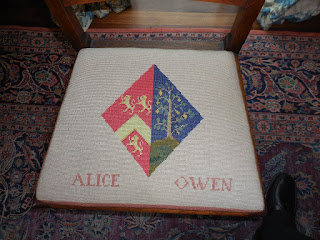
 

Alice Owne we've already had.


The Institute of Brewing basically adapted the Brewers' Company arms for their own. The relatively young age of the Institute doesn't stop it getting a coat of arms as this sort of thing still goes on today. As indeed does making new livery companies, the Worshipful Companies of Management Consultants, International Bankers and Tax Advisers being recent additions.


And finally here's in full the rug with the arms of the Brewers' Company and the schools it supports:


* Heraldry and Brewers' Hall, W.H. Bird. Journal of the Institute of Brewing, December 1937.

Thursday, 10 December 2015

Beer and wanking

One of my happy birthday beer books was Mikkeller's Book of Beer. Back in the early days of being an internet beer bore I noticed that Mikkeller beers caused a great deal of excitement amongst some of my fellow beer nerds. I've not been overwhelmed when I've them myself, but I was interested enough to get the book put on my wish list.


I had heard that Mikkel was a gypsy brewer, but I was surprised to see that he doesn't actually brew on other people's kit, as he considers the actual brewing to be just manual labour. This does make him sound a bit of a tosser. And I'm not the only one to think so, as in a comment on Stonch's blog it's alleged he spends all day lounging round his flat wanking before emailing recipes over to breweries. Presumably with his free hand.

Still nice work if you can get it. As to the book it was an entertaining enough read. As is usual with books of this type it has an overview of brewing riddled with inaccuracies, and an account of brewing history untroubled by any of those annoying facts that get in the way of a good story.

I'm not going to bother point out what errors are, as lets face it it's not a scholarly work. The story of how Mikkeller came to be is interesting, the man behind it started out as a keen homebrewer but never moved to professional brewing, instead sending instructions to professional brewers. The book also includes a range of beer recipes and an extensive beer and food section for those that like that sort of thing. It's a fun read for a beer nerd, though more like sitting down with a Sunday supplement than studying a text book. If you're into serious brewing history you'd be better off with something by Martyn Cornell or Ron Pattinson and for brewing weird shit the excellent Radical Brewing remains unsurpassed. 


Friday, 4 December 2015

The Science of Drinkability

Well a bit of the science anyway. I've managed a quick perusal of the archives on drinkability and was impressed to see that there was a symposium on it in 2006. And even better The Brewers' Guardian did a write up of the proceedings.

First I was very surprised to see that the term ‘drinkability’ seems to have been coined by a Brazilian PhD student, Rubens Mattos, as recently as 2004. Apparently it caused a lot of excitement in the brewing industry and lead to the symposium. In the introduction to Mattos's paper on drinkability he said: 
“a beer that has good drinkability is one that invites the drinker to another glass.”
  He was at the symposium in 2006 where he defined drinkability as:
“a measure of how enjoyable and attractive a beer is in order to be consumed in large quantities”.
The large quantities part is important, and many a beer nerds seems to confuse ‘drinkability’ with enjoyability, and consider any beer they like to be drinkable. Mattos considers drinkability to be:
“ a characteristic that prevents consumers from being satiated even when large volumes have been consumed.”
In more detail (he was doing a PhD after all) Mattos considers drinkability to be composed of four factors: sensory and cognitive effects, and post-ingestive and post-absorptive responses.

The next up at the symposium was, David Thompson, who spoke on the psychology of drinking. He equated drinkability with sessionability (it would seem the term ‘sessionability’ was in use already). Sessionability was defined as:
 “asking the barman, ‘same again, please’”
Again, the consumption of volume is clearly important so those of you that say Imperial Russian Stouts have great drinkability, or that you can session Double IPAs, you're wrong.

Keith Greenhoff from a market research company also equated drinkability with sessionability when he spoke and his definition was:
“an absence of characteristics limiting consumption in volume, making it easy to drink.”
These characteristics included high carbonation, increasing bitterness and excessive sweetness. A definite point there for those that say cask beer has the greatest drinkability, with high carbonation being a negative factor. 

A more positive drinkability definition was given by another student Katrin Mathmann as:
“drinkability means the drink agrees with the consumer and encourages the consumer to keep on drinking.”
There's perhaps not a dictionary definition from the symposium. But I think the key points are covered, and it's clear that serving beer as god intented, without extraneous carbon dioxide, gives the best drinkability.


Tuesday, 1 December 2015

Drinkability

Some twaddle tweeted on twitter has led to a discussion on drinkability over at Boak and Bailey's. It's a term that I've always thought had a bleedin' obvious meaning, but it would seem it's not obvious to all.

I was also surprised to see it stated that:
"Whether cask ale is the most ‘drinkable’ type of beer is debatable"
I thought that this was a well established fact, but I must admit I don't have a reference for it. So I've had a quick look at beerknowledge.info to see what it's got on "drinkability" and there's quite a bit there:


So if I get time this week I'll look into it and see if I can bring some science to discussions on drinkability.

Thursday, 26 November 2015

Bass brewery to close


Molson Coors have confirmed that their Burton (South) plant is to close in September 2017. The brewery is perhaps better known as the old Bass brewery. Production will be transferred to the Burton (North) plant, the old Allied brewery.

I did hear rumours that the Burton (South) plant was under threat a while back, as apparently it’s basically a large Carling factory and Carling sales are in decline. The news it will close was confirmed in a local paper three weeks ago.

Friday, 20 November 2015

A visit to Crisp Maltings

"Insist on Crisp" isn't quite up there with "Put some pork on your fork" as far as marketing slogans go but it almost rhymes and that's got to be worth something. I visited Crisp Maltings in Ryburgh the other week for an excellent tour of the site.


They have a few different types of maltings there.


First we saw the eight tonne pilot maltings which has a combined steeping, germination and kilning vessel.


At the  pilot maltings at work we have kilns separate from the steeping and germination vessels, but at 50kg capacity each are on a rather different scale.


Then we were off to our next port of call, the floor maltings.


As you would expect at a floor maltings it was quite historic, dating from 1870.


There are three floors, each of which can take seven tonnes of malt, the grain being laid on the floor 10cm deep.


There has been some modernisation so there is air conditioning rather than just windows.


Up at the top were barley storage areas, though these aren't used anymore.


All three floors of malt are kilned together, the kilning taking three days. Though the floor maltings was closed for servicing whilst we visited it's normally in pretty much constant use.


Crisp store 40,000 tonnes of barley on site.


It's analysed on arrival and if not up to scratch is rejected, though the rejection rate is less than 1%.


The central laboratory facilities are on site too.


For microbrewers they mill grain, and the mill is working at close to capacity.


Barley is dried gently (max temp 40-44°C) to less than 12% moisture for storage.


If the farmers bring grain with greater than 15% moisture they'll be charged for the drying!


To keep costs down they have their own effluent treatment plant and use borehole water.


Most of the malting is carried out on two mid 90s plants, each with a 220 tonne batch size. Sadly none of my photos from inside the big plant turned out well due to the humid atmosphere.

They have flat bottomed steeping vessels. This gives a shallower and more uniform bed depth than a conical bottomed steep tank, but does use more water and is harder to clean.They steep to 44-46% moisture, the moisture and temperature varying slightly depending on which type of malt is being made.

The circular germination vessels have a bed depth of 1.8m over a wedge wire floor, with a giracleur to level and turn the grains. Two steeps are used, with a total germination time of 48 hours. Air can be vented or recirculated to control temperature. Approximately 0.5% moisture is lost each day.

In the kiln heat is first applied to the grains with high air flow and low temperature. When the air off humidity is less than 100% the temperature can be increased, the final kiln temp ranging from 85-110°C depending on the type of malt being made. Kilning takes 24 hours. The two kilns run in staggered tandem so heat can be moved back and forth between the kilns e.g. after the break point (less than 100% humidity) air one kiln can be used to heat the other kiln. The bed depth is 1m.

After kilning the malt is analysed and goes to storage. Batches are blended to meet customer specifications. Big brewers can ask for their own specifications, microbrewers get what the regionals asked for!